Yuka - The mobile application that scans your products
Role / UX/UI Designer
UX evaluation of the user experience using different analysis methods and proposing new features to complete the interface offering while strengthening the initial offering

Design thinking framework
1. Discover
The benchmark and consumer survey allowed us to establish new features such as a calorie counter associated with a recipe catalog.
2. Define
The UserFlow allowed us to clearly identify the integration flow of these new features
3. Ideate
The ideation objective was to visualize this market opportunity and tailor-make functionalities that meet the target's needs.
Consumer survey
Conclusions: Respondents lead urban lives and are concerned about the nutritional value of their food, as well as its calorie intake. When they buy products, they do so in stores, to visualize and handle the food before purchasing it. They cook and find sufficient inspiration at the last minute or in the aisles to determine their meals for the week. Finally, they monitor their diet and research so-called "healthy" nutrition to prepare healthy and balanced meals.
Hypothesis/Angle of approach
It would be useful to add a calorie counter per portion to make it easier to plan daily meals using the Yuka app.
New Features
-
Calorie Counter = Daily graph with calorie intake by weight, age and gender
-
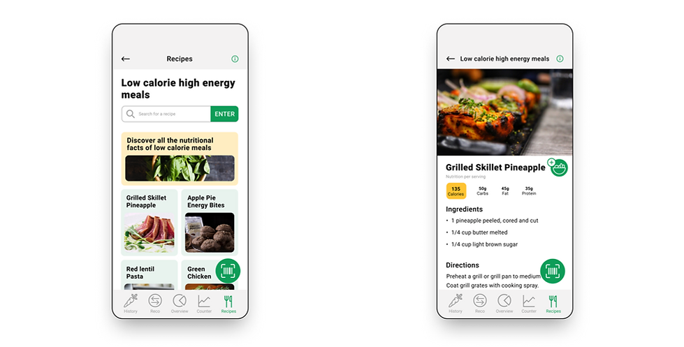
Recipes and their calories per serving according to a diet or not
My role
Redefine the Yuka app experience by adding features based on market offerings. The goal is to transform Yuka into a multifunctional application that can meet multiple user needs. The targeted need here, according to the research conducted, is to be able to count daily calories by scanning or manually entering products or meals into the app.
Userflow
Resolution around the new main feature: the calorie counter

User testing
5 participants d’âges et de sexes différents / Méthode: Think out Loud
Goals
-
Define whether adding items to the calorie counter via different methods is well understood.
-
Decide on the understanding and readability of the icon allowing additions to the calorie counter.
-
Identify any knots in ergonomics that slow down users in achieving their goals defined in the scenarios.
Scenarios
-
Can you add a recipe like "Grilled Skillet Pineapple" to the calorie counter in the "Lunch" section?
-
Can you add a product like "Popcorns" to the calorie counter in the "Snacks" section via the app scanner?
-
"Peanut Butter Toast" is displayed in the "Breakfast" section of the calorie counter, can you adjust the calories of the "Peanut Butter Toast" meal from 100 to 200 calories?
Analysis

Understanding clickable areas
The results
Three out of five participants took time to find the "Add meals" button. They expressed not knowing if it was a button or if it was clickable. "It's not intuitive, I didn't find the "Add meals" button easily. It's so small, you can't see it." Then, two out of five participants wanted to click on the calorie details in the field to the right of the carrot to edit the calories. "The area on the left is clickable, why is the area on the right blocked?"
The consequences
The clickable areas are not clear enough. The experience is considerably lengthened, frustrating for some, as they were unable to understand the accessible options associated with this page. For participants, the "Counter" page is a central page in the experience; they expected to have access to more features through it.

The category page of the "Recipes" tab
The consequences
There is a complete misunderstanding about how the experience works by category in the "Recipes" tab. This page is a necessary step to get to the recipes and not all participants knew what to do. The tree structure is therefore not clear enough, which gives a feeling of dead end once you arrive at this page, resulting in a huge waste of time.
The icon for adding meals to the counter
The consequences
Adding a recipe to the calorie counter takes longer because some participants questioned the icon's functionality. Understanding the icon isn't optimal, even though its function is central.
